Turn a CSV into a bar chart race
About 7 minutes
Bar chart races need one specific data shape. Get that right and everything downstream — importing, tuning, exporting — takes a couple of minutes.
- 1
Shape your spreadsheet
One row per competitor, one column per time period, with the first column holding names and the header row holding period labels. Export it as CSV from Excel or Google Sheets (File → Download → CSV). Values can include $ signs and commas — the parser strips them.
country,1990,2000,2010,2020 China,1135,1263,1338,1411 India,873,1057,1234,1396 USA,250,282,309,331 Indonesia,181,214,244,273 - 2
Drop it on the homepage
Drag the CSV onto the prompt box (or click "Add CSV"). Add a short prompt alongside it if you want to steer the result — "make it a dark cinematic race" — then Generate. With 4+ periods and 4+ rows, the Director will choose a bar chart race automatically.

- 3
Tune the race in Data mode
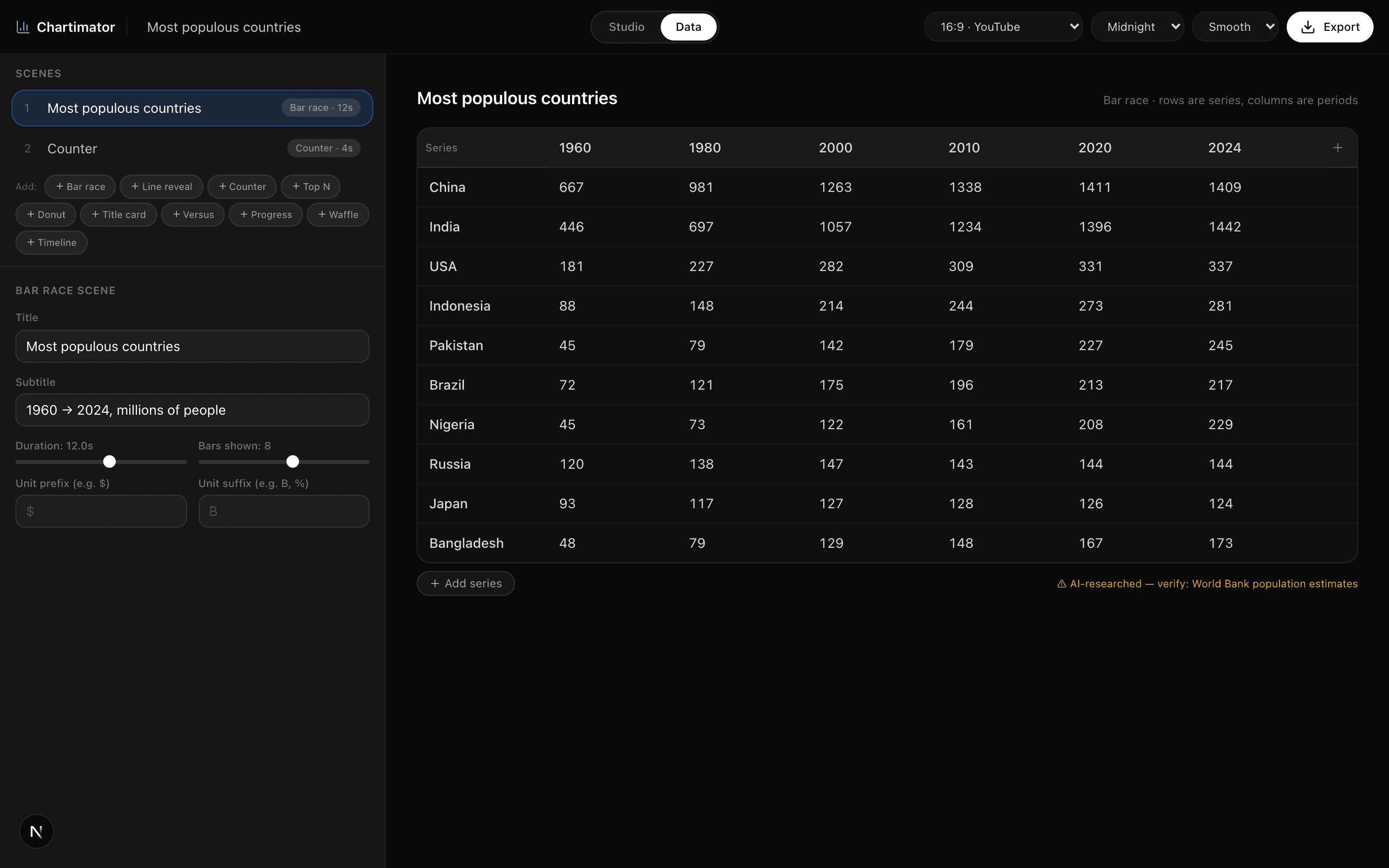
Flip the header switch to Data for the full-width grid: fix labels, adjust values, add periods (each new column pre-fills with the previous period's values). Rows and columns can be added or removed from the grid edges.
- 4
Set bars, duration, and units
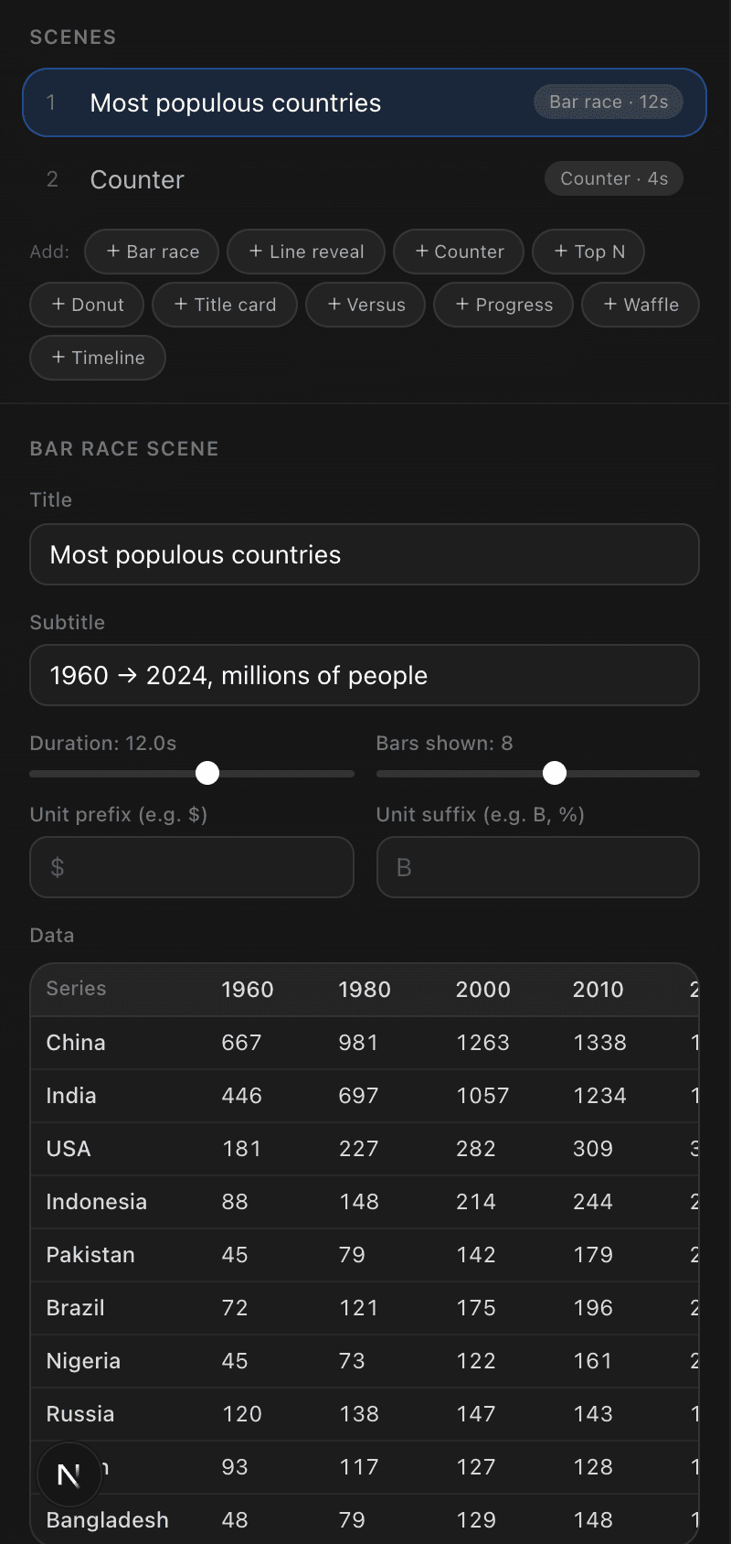
Back in Studio mode: "Bars shown" controls how many compete on screen (8 is the sweet spot; past 10 gets cramped on phones). Duration controls how fast the race runs — about 1.5 seconds per period feels right. Set a unit suffix (M, B, %) so the counting labels mean something.
- 5
Export for your platform
Pick 9:16 before exporting if this is for TikTok or Shorts — the race relayouts for vertical, it's not a crop. Then Export → MP4 downloads directly.